MMXM Model Market Maker Models
MMXM Model: Market Maker Models. This lesson explains how MMBM and MMSM develop, where liquidity is targeted, and how to identify the model forming.

A Complete Blueprint to ICT Trading Strategy
I’m not here to overwhelm you with every single concept which exists in ICT Trading. I’m here to show you exactly what I learned, what I use, and what’s actually working for me and my students in real-time trading. By learning all the ICT Trading Concepts and adding to that learning the ICT Trading Strategy and applying it correctly, you would become a professional Trader in the short run.
Liquidity refers to how easily an asset can be converted into cash. An asset is considered highly liquid if it can be quickly sold without affecting its price. In trading, liquidity means the presence of enough willing buyers and sellers at the current market price. For a buyer to purchase an asset, there must be a seller and vice versa. This balance is what allows the market to function smoothly. In trading, liquidity is measured by the volume of active or pending orders. Market makers often target areas of high liquidity, which typically means hunting the stop losses or pending orders of retail traders.
Price Moves from Liquidity Pool to Liquidity Pool Price is attracted to areas where lots of orders are placed like stop losses or pending buys/sells. These are called liquidity pools. The market moves from one pool to another to fill out those orders.
Price Seeks Liquidity to Continue Moving For price to keep moving, it needs volume. Liquidity provides that volume. So, prices naturally move toward zones where there are more active orders to be filled.
Big players often push prices into liquidity areas to trigger retail stop losses and fill their own positions. Recognizing these patterns helps you avoid traps and trade smarter.
There are two types of orders in trading that are buy side Liquidity and sell side Liquidity. So, liquidity is also of two types which are explained below.
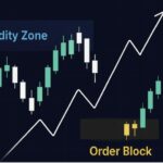
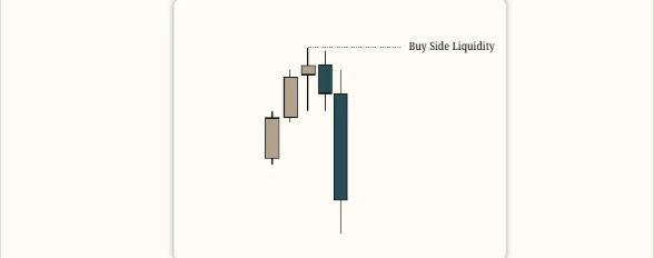
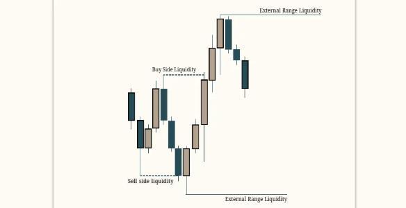
Buy Side Liquidity, according to Inner Circle Trader (ICT), refers to the cluster of pending buy stop orders resting above market price. When traders open sell positions, they often place buy stops above their entry to protect against losses if the price moves higher. This means that anyone selling at a certain level will likely have a buy stop placed above it. As a result, areas like previous days’ high, weekly high, or equal highs are considered zones of buy side liquidity. These are targets for market makers, who aim to trigger those buy stops in the form of Liquidity Sweeps
Buy-side liquidity resting above old highs.
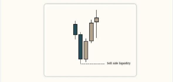
Sell Side Liquidity, as defined by Inner Circle Trader (ICT), refers to the buildup of pending sell stop orders below key price levels. When traders enter buy positions, they often place sell stops below their entry to protect against losses. These stops usually sit beneath significant lows like daily lows, weekly lows, or equal lows-making those levels, areas of sell side liquidity. Market makers target these zones to trigger sell stops, turning them into market sell orders. Once the liquidity is taken, price often reverses, allowing smart money to profit from retail traders’ losses.
This concept highlights how market makers use liquidity to manipulate price movement in the form of a Liquidity grab.
Sell-side liquidity resting below old lows
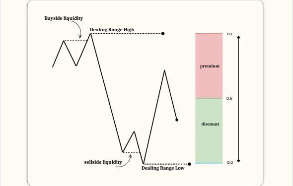
In ICT Trading, a Dealing Range is a specific price range formed after the market has taken out both buy side and sell side liquidity. It’s not just any Swing high and swing low; it must include a Liquidity grab (Liquidity Sweep) on both sides. For example, if price first takes out a previous high (Buy Side Liquidity) and then drops to take out a previous low (Sell Side Liquidity), the area between those two points defines the Dealing Range. This range becomes important for analyzing price action, setting targets, or anticipating where premium/discount levels may be respected in future moves.
This ICT Trading concept works because it helps traders identify areas where significant market activity has occurred, providing a framework for anticipating future price movements. By understanding where liquidity has been taken, traders can better predict where the market might go next often expecting price to return to a discount or premium within that range. When using the dealing range, it’s important to consider the timeframe you’re analyzing, as the dealing range must be relevant to that specific context. Dealing ranges are also fractal, meaning they can exist within larger ranges or consolidations, offering multiple layers of analysis.
A key tip when using dealing ranges with respect to ICT Trading, is to observe whether price respects the boundaries of the range, and to combine this concept with tools like Fair value gaps and Order blocks for more precise entries and exits.
However, traders should be cautious and ensure they are identifying the dealing range correctly based on ICT’s definitions. Misidentifying it can lead to poor trade decisions.
The Premium and Discount concept involves dividing a price range into two halves using the 50% midpoint as the dividing line. The area above the midpoint is known as the Premium, where prices are considered expensive, making it a favorable zone for selling opportunities. The area below the midpoint is the Discount, where prices are seen as cheaper ideal for buying opportunities.
This approach works because markets often revert to a mean or equilibrium and identifying whether price is in premium or discount helps traders make better entry and exit decisions. For example, in a consolidation range, if price is trading above the midpoint, it’s in the premium zone possibly a good area to look for shorts.
Conversely, below the midpoint (the discount zone), traders may look for long setups. To apply this effectively, combine it with tools like Price Delivery Arrays (PD Arrays), Order Blocks, or Fair Value Gaps. However, traders should also factor in market structure and order flow, as the premium/discount model works best when aligned with broader market context.
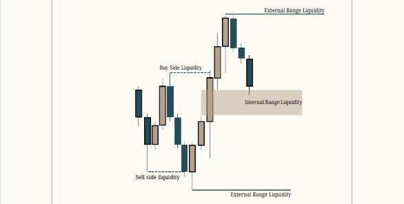
External Range Liquidity refers to the liquidity that lies outside the boundaries of a dealing range specifically, above the high and below the low of that range. According to ICT, the highs and lows of any dealing range are considered external liquidity, because that’s where stop-loss orders often rest. These areas attract the market’s attention, as they contain a concentration of pending orders from traders who entered positions within the range.
When price moves toward these levels, it often does so to trigger those stop orders, creating a sudden burst of volatility. For example, a break above the range high targets buy-side external liquidity, while a break below the range low targets sell-side external liquidity. Understanding this helps traders anticipate potential liquidity grabs beyond the range.
Internal Range Liquidity refers to liquidity within a defined trading range, typically between a recent External Liquidity high and low. It includes areas like Fair value gaps, Order blocks, or Liquidity voids that exist inside this range. Traders often look for prices to move toward these internal liquidity points during retracements or consolidations within the range. This concept works because price tends to seek liquidity to fuel movement. By identifying these internal points, traders can anticipate where price may react before breaking out of the range.
For example, if price is trading within a Swing high and swing low, it may first target a fair value gap or Order block inside the range before reaching for anything beyond it. A practical tip when using internal liquidity is to clearly mark the recent Swing high and low that define the range, then observe how price behaves around key Liquidity zones within that range. However, keep in mind that market conditions can vary, and prices may not always follow the expected path.
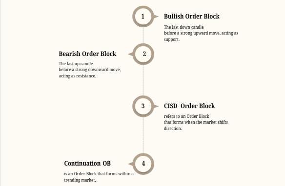
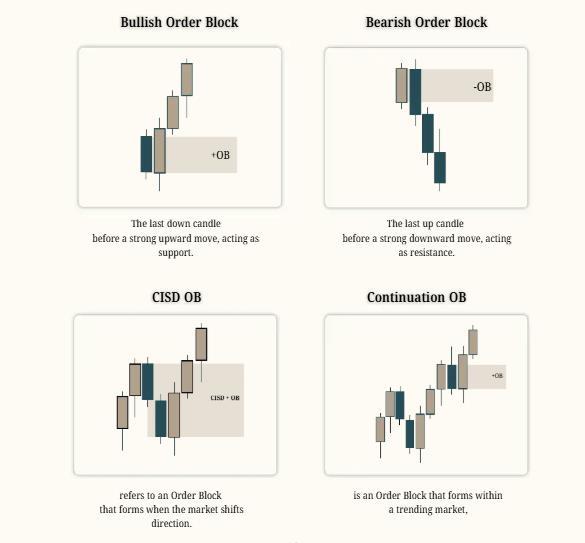
An Order block in ICT Trading is the area in the price chart, where a large number of orders are executed by institutional traders in the market, and the market shows sudden strong move from that area. Retail traders follow institutional footprints, so they wait for these Order block zones to buy or sell in the market & make profit along with big institutions like banks
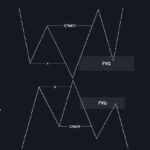
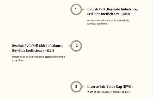
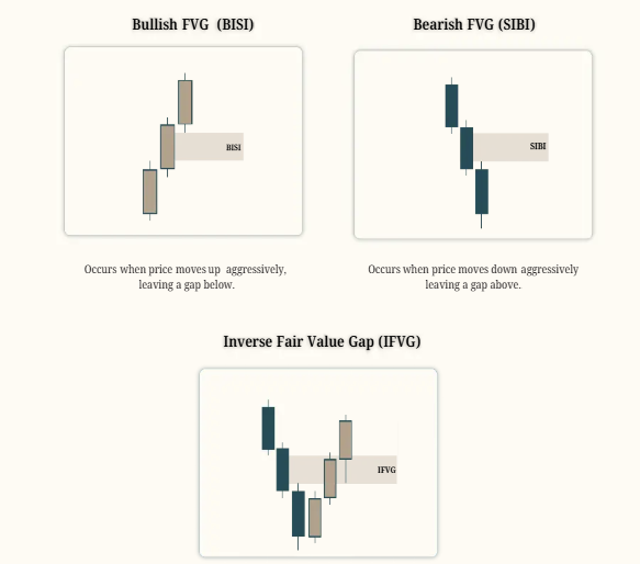
A Fair Value Gap (FVG) is an imbalance in price action where the market moves too quickly, leaving a gap between candles. This occurs when there is aggressive buying or selling, causing inefficiencies in price delivery.
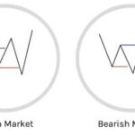
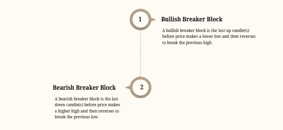
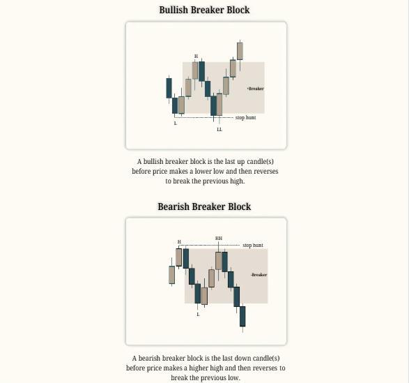
A breaker block is a type of price action pattern that signals a shift in market structure after a stop hunt or liquidity grab. In a bullish breaker, price forms a low, then a high, followed by a lower low that sweeps the previous low. After this, price reverses and breaks above the previous high.
The last up-close candle(s) before the drop to the lower low becomes the breaker block. When price returns to this zone, it often acts as a key level for long entries.
In a bearish breaker, price creates a high, then a low, followed by a higher high that sweeps the previous high. Once price breaks back below the previous low, it confirms a shift in direction. The last down-close candle(s) before the rally to the higher high becomes the breaker block. When price revisits this level, it becomes a potential area for short entries, acting as resistance.
Inter-market analysis is a very simple idea that can help you BUILD bias.
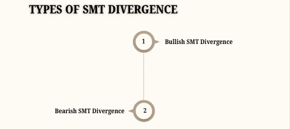
SMT Trading: It’s the willingness to crack the correlation between markets like NQ and ES, EURUSD and DXY, or EURUSD and GBPUSD hinting a potential change in the current market direction. An SMT divergence happens when we reach an objective in one Instrument but fail to reach it in another. Usually a swing high/low or an FVG.
The highest time frame to trade SMT divergences is most relevant when in line with higher timeframe bias or soft bias. Don’t rush looking for an SMT Divergence ICT Trading to call tops or bottoms. SMT divergence ICT Trading is a CONFIRMATION tool. We use it to confirm a possible change in direction in line with a higher timeframe thesis. SMT divergence ICT Trading allows us to identify when price is in accumulation or distribution.
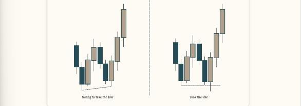
If after reaching a Discount HTF level NQ makes a higher low, but ES makes a lower low, this is a sign of Accumulation. It’s very likely that we get a false break lower in ES and push higher in both markets. NQ fails to take the low cracks into the correlation, hinting strength first.
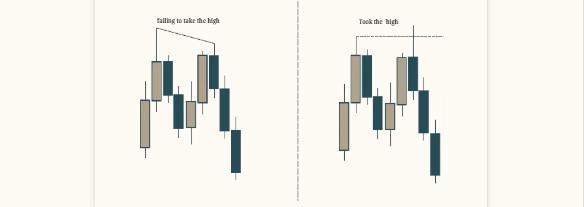
If after reaching a premium HTF level NQ makes a higher high, but ES makes a lower high, this is a sign of Distribution.
It’s very likely that we get a false break higher in NQ and push lower in both markets.
ES failing to take the high cracks the correlation, hinting weakness first.
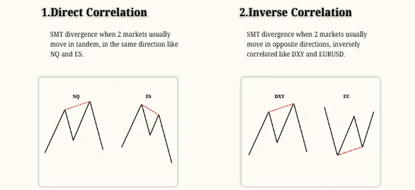
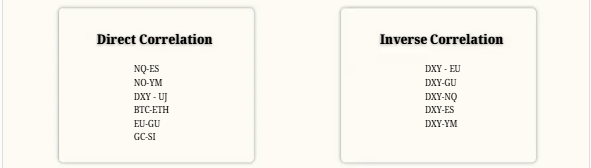
This is a quick list of examples of assets that are directly correlated and tend to move in tandem and inversely correlated assets that often move in opposite directions.
That’s the nature of a Candlestick; there is AMD (PO3) in every candle.
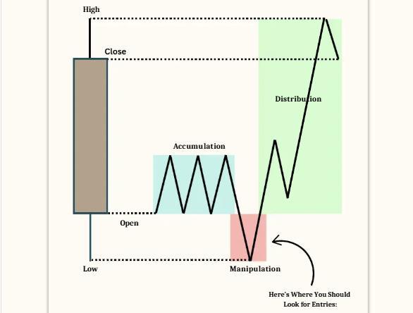
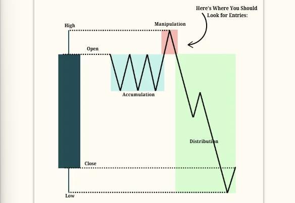
The concept of PO3 ICT Trading, or Power of Three, is a trading framework that involves three key phases: accumulation, manipulation, and distribution. This framework can be applied to any timeframe, though it was initially introduced using daily charts.
Accumulation Phase: This is where positions are gathered. For example, if the market is expected to be bullish, traders might accumulate long positions below the opening price. This phase often involves the market moving in a direction opposite to the anticipated trend, which can mislead retail traders into thinking the market is going to continue in that direction.
Manipulation Phase: During this phase, the market might move against the anticipated direction to trigger stop losses or induce traders to take positions in the wrong direction. This is where the market sets up for the real move by creating a false impression of the trend.
Distribution Phase: This is where the market moves in the anticipated direction, often rapidly, as the accumulated positions are distributed. For a bullish scenario, this would mean the market rallies, creating a high before closing near that high.
The Power of Three works because it leverages the natural market cycles of accumulation, manipulation, and distribution. By understanding these phases, traders can anticipate market moves and position themselves accordingly.
Suppose you expect a bullish move. You might see the market open and drop below the opening price (accumulation), then rally above the opening price (manipulation), and finally move higher to close near the high of the day (distribution).
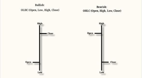
When you understand the daily candle OHLC/OLHC, you can get an idea of where the daily candle is most likely to expand. You can use that for your daily bias.
You can use the H4, H1, M30 Candles’ OHLC, OLHC for trade setups. For example, when you are looking for an entry at a key level, if there is any possibility, you can wait for an H1 or M30 candle to open. This allows you to confirm the opening price and observe how the price reacts. This gives you more confirmation for your entry.
Order Flow refers to the way buy and sell orders move in the market, influencing price action. It helps traders understand who is in control (buyers or sellers).
Order flow helps you determine whether buyers or sellers are in control, allowing you to trade with the TREND.
If you trade against higher timeframe order flow, you are more likely to get wrecked. The higher timeframe dictates the main trend.
Even the best entry model won’t work if you trade against higher timeframe order flow. Smart money follows the higher timeframe trend, and aligning with it increases your WIN rate.
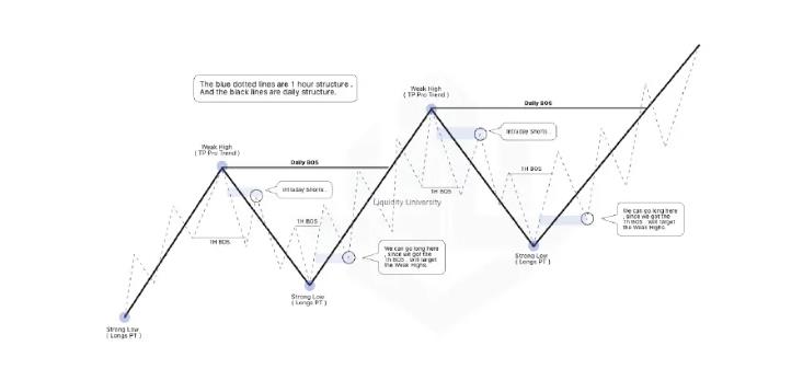
Understanding market structure is the first step in identifying order flow. It tells you whether the market is in an uptrend, downtrend, or moving sideways. In a bullish market structure, you’ll see prices forming higher highs and higher lows — a clear sign that buyers are in control. In a bearish market, the structure shifts to lower highs and lower lows, showing that sellers are dominating. By reading these structural shifts, you can anticipate whether price is likely to continue in the current direction or prepare for a reversal. Market structure gives context to the flow of orders behind price movement.
PD Arrays, or Premium and Discount arrays, are high-timeframe zones where smart money tends to take action. These levels are based on price being above or below the equilibrium (typically drawn from a range or dealing range). When price enters the premium zone (above equilibrium), it’s seen as expensive — making it a potential area for institutional selling. On the other hand, when price dips into the discount zone (below equilibrium), it becomes attractive for buyers, especially in a bullish narrative. Watching how price reacts at these levels helps traders align with the real order flow and avoid chasing moves in the middle of the range.
The break of a Swing high or low is a major signal in order flow analysis. These swing points represent liquidity resting above highs or below lows. When price breaks a recent high in a bullish context, it often signals that buy side liquidity has been taken — and if price continues higher, it confirms strong bullish order flow. The same applies in reverse: breaking a swing low in a bearish trend confirms seller dominance. However, if price breaks a high and immediately reverses, it could signal a liquidity raid instead. Observing how price behaves around these breaks reveals who’s truly in control — buyers or sellers.
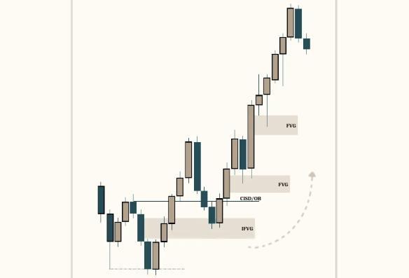
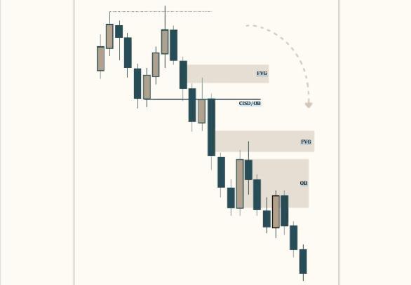
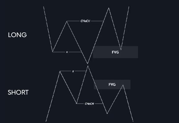
CISD stands for Change in State of Delivery, and it marks the beginning of a Market Structure Shift intention — often after a Liquidity grab or Liquidity Sweep. For example, imagine price spikes above a recent high (taking out buy stops), but instead of continuing up, it violently reverses, and there is a break of structure to the downside.
This sharp, one-sided move is known as displacement, and it indicates a true change in order flow from bullish to bearish. CISD Trading moments are crucial because they help traders identify the exact point where the market shifts direction. Recognizing CISD allows you to get aligned with smart money instead of being trapped by false moves.