Fractalizing Candle Range Theory
When using CRT Trading, it is important to find and understand what candle ranges to look for. We can use candles as a structure or "skeletonˮ to have a good understanding on what price wants to do, and when.

It is important to always know in what phase the price is at a certain moment.
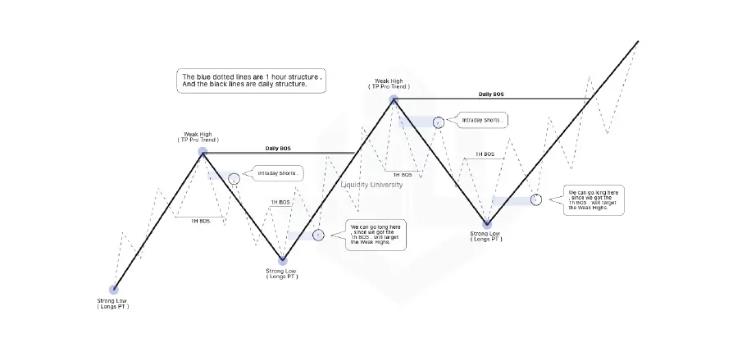
For example: If the market is in an uptrend on HTF and you just created an HH, the price has most likely established a new bullish TR, so in theory, the price has finished its impulsive phase and now starts your pullback phase.
On Daily and Weekly you will be bullish, but you can trade the retracement on shorter timeframes like 1h once the price starts to show a change in the 1h structure from bullish to bearish. You will be trading a daily pullback, but typically those pullbacks are several hundred pips, so it is often worth taking the risk and trading Countertrend (CT).
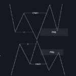
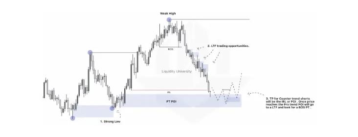
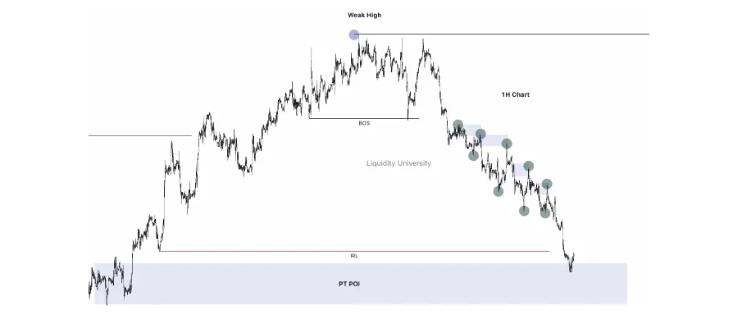
In the example below you can see how our Swing structure is the black line, and the blue one is the intraday price action. It shows how what in Daily is a retracement, in a lower TF (1h) it can be intraday shorts with TP areas in discount of our daily TR.
Once in POIs (Order block, Supply and Demand Zones) of the daily TR, we will wait for the lower TF to go to Pro-trend. Swing analysis with intraday entries gives a large Risk-Reward (RR). This applies to all TFs: 4h structure and entry with a 15m structure or less.
All the blue dots are daily structure points. We see price making a BOS and creating a new HH. We know by now that once the price makes a BOS, a pullback should be anticipated.
As shown in the image, the 1hr made a Break of Structure, which lets us know that price is going to make a pullback. By knowing a pullback is happening, we can take CT (counter trades) from the 4h & 1h structure until we reach the daily POI. Once the price reaches CT TP, we will look for PT (pro trend) long opportunities on the LTF.
We all know the saying “The market is Fractal” because what is shown in a Daily chart, we can also see in TFs of Minutes or even in Seconds. Large Timeframes like Daily, Weekly, or Monthly will give you your long-term Bias, and 4h or 1h price action will give you your short-term Bias and are the ones you will probably see most often since those TFs will help you find the POIs you will be looking to enter trades with for an intraday or Swing TP.
The reason we use LTFs in conjunction with HTFs is because the same concepts work across all TFs. That is because the price does not know time and time does not know the price.
Order Flow only understands Order Flow. What this means is that the same behavior that you see in the Daily TF, you will also see in Minutes and even in Seconds TF. We have all heard that “small timeframes are just Noise”. Yes, it’s just “Noise”, if you don’t know how Order Flow and Market Structure work.
Something important that we must learn to correctly identify is our largest structure, because, for example, if we see that we have a bullish Daily and Weekly structure and the price is creating an HH, we expect a pullback at some point.
When the pullback begins, in TFs of 4h or 1h it will seem that it is a trend change and many get confused there. It is key to interpret the TR and the structure so as not to get confused. The 4h-1h pullback will only be a correction to Discount prices, to reach POIs and mitigate them and then continue with its HTF trend.
That is why multi-timeframe analysis is crucial. Combining our understanding of Structure and Timeframes will help us to have a solid foundation to anticipate what is most likely to happen in the market.
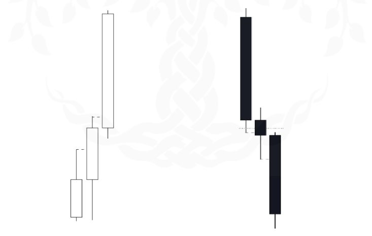
A 3 Candle Formation is an SH, WL, SL, WH (QM) when broken down into a lower timeframe. This is why the 3 Candle Formations work as Swing Points and Structure.
A Swing Low is a Bullish QM when viewed on a Lower Timeframe, and a Swing High is a Bearish QM when viewed on a Lower timeframe.
This also works the opposite way: if you see a QM, then it means it’s a 3 Candle Formation on a Higher timeframe.
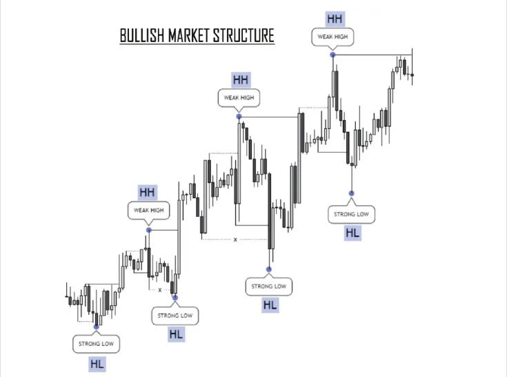
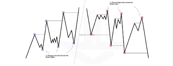
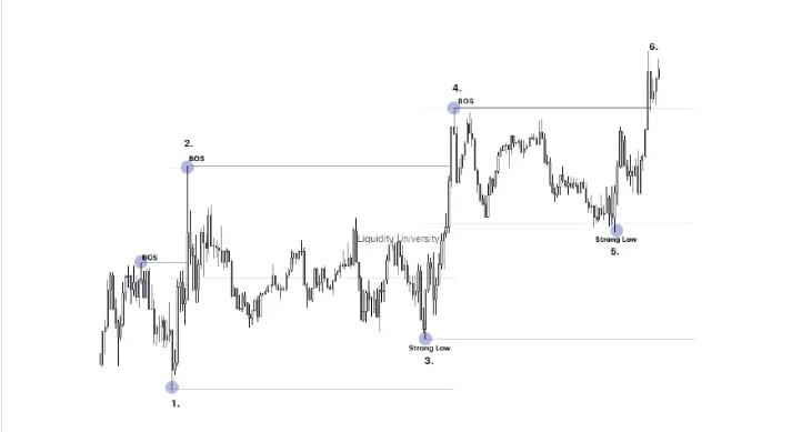
Strong Points: They are strong structural points that, when formed, create an impulsive movement that results in the breaking of Weak Points (previous Highs or previous Lows) and that, once they create new Highs or Lows, create a new Trading Range (TR). Once we can identify our TR, we will have a solid base on which we can operate.
Weak Points: These structural points are those that will serve as TP once we enter into a Strong Point trade. They are called Weak Points as they are broken by Strong Points.
HTF Narrative: By understanding our HTF narrative, along with our Strong Points and knowing what phase the market is in, we can get a solid idea of what is happening. Always looking at the structure of the larger Timeframes will prevent you from getting lost in the price action of small timeframes. When you feel confused about small TFs, always look at the bigger picture on the HTF.
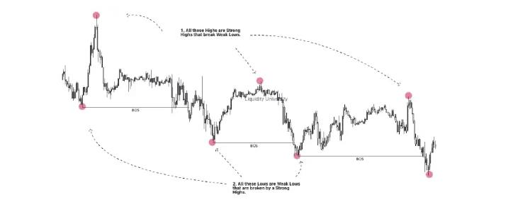
Strong Highs are those Lower Highs (LH) that form in a bearish structure and when formed create new Lower Lows (LL). In those areas of Strong Highs, we will find most of the time our points of interest for shorts, and our TP will be the IRL and the Weak Lows. (For every strong High there is a weak Low.)
To be considered a Strong High it must do the following: it must cause manipulation and break structure.
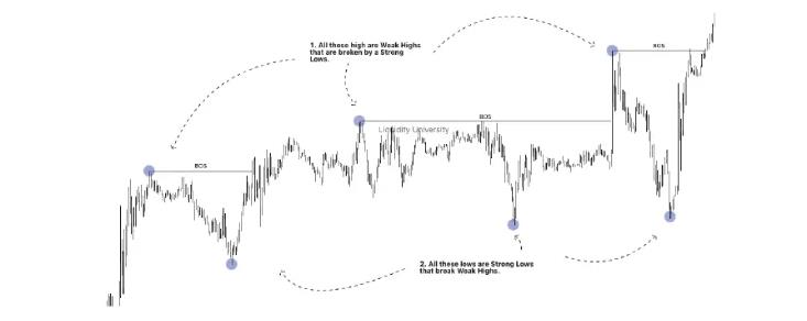
The Break of Structure (BOS) should always be considered as the breaking of a Weak High or a Weak Low, and this applies to all TFs.
When we are identifying or mapping the structure, it is important to identify a true Break of Structure, since the correct price direction we see when analyzing the market will depend on it.
To take into account a Break of Structure as a true Break of Structure and not a False Break of Structure, we must always wait for it to be a break of a Weak High or Weak Low, and preferably a break with a candle body. Sometimes we will be able to take into account a Break of Structure with a wick, depending on the reaction and the speed with which the price reacts after seeing the supposed Break of Structure at that moment. Timeframes will often depend on this because what in 4 hours is a wick, in 1 hour will be candle bodies. This applies to the TF of minutes as well.
Valid Bullish Break of Structure
Valid Bearish Break of Structure
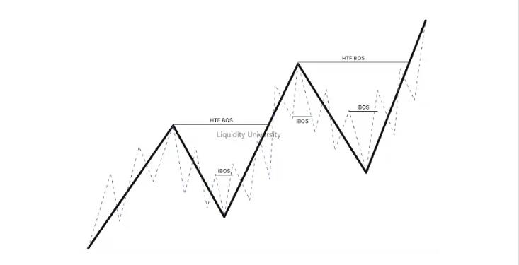
This Internal Break of Structure is one that occurs within the HTF structure but is only noticeable in LTF. This type of Break of Structure will help us to have LTF entries using HTF analysis, which will result in our SL decreasing and our Risk Reward increasing drastically. For there to be a trend change in HTF, there must first be a trend change in LTF.
For example: Within the Daily range, a Break of Structure will be given on the 1h TF first, and for there to be a Break of Structure in 1h, there will be a Break of Structure in 15m. A Break of Structure will occur in an LTF first before the HTF makes a move.
One important thing to keep in mind with market structure is to apply logic to what the price is doing at the moment.
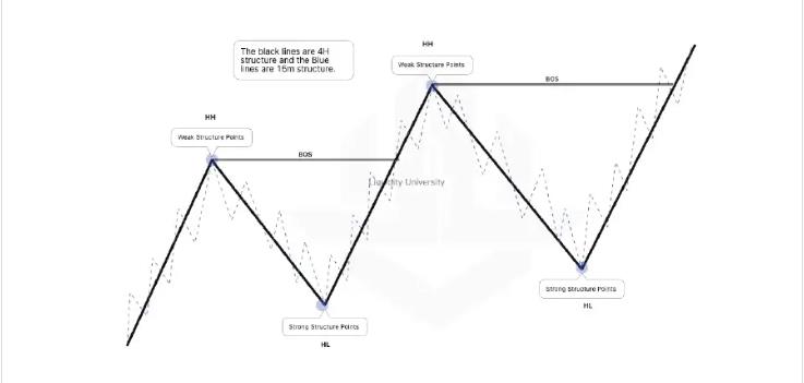
There is a logical way in which we can anticipate a trend change in the market before it happens, and that is by observing the willingness of the price to create new Highs or Lows. It is super important that you understand this and practice it yourself by back testing the charts. In the example below, the black line represents HTF and the blue line LTF.
Example:
If the price does not break a Low, the most LOGICAL thing is that it breaks a High. But for it to be a valid structural change, a Strong Point must be broken. If the High with the green dot cannot create a new Low, then there is a high chance it can be a change of trend. So, there are two possible outcomes.
If the price does not break a Low, the most LOGICAL thing is that it breaks a High. But for it to be a valid structural change, a Strong Point must be broken. If the Low with the green dot cannot create a new High, then there is a high chance it can be a change of trend. So, there are two possible outcomes.
We are traders; we exchange one thing for another, and we pocket the difference whether negative or positive. In this profession there are only two methods of winning: buy low or sell high.
As traders, our job is to find the best buying opportunities and the best selling opportunities, and we should not waste time looking for deals that are not worth it. If we must focus on only buying very cheap and selling as expensive as we can, then how do we know what our best selling or buying opportunities are?
For that, we are going to use Fibonacci, but not as used by the vast majority of traders who operate with Fibonacci.
Most traders use the Fibonacci because it helps you see what percentage of the last push the price is going to retrace.
The difference is that Fibonacci traders believe that the price went up or down because it bounced off a Fibonacci level like 61.8 or 78.6 (Golden Ratio). But the truth is that it is not so.
The reality is that our POIs are usually located in the areas where these Fibonacci levels are, and most people do not know what they are and the logic behind them.
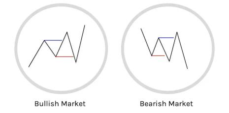
Bullish P & D
Bearish P & D
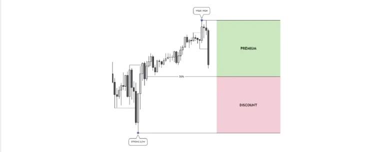
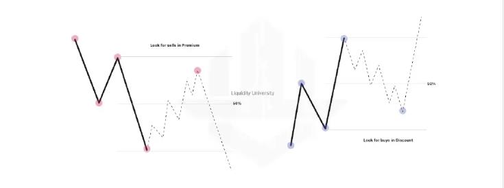
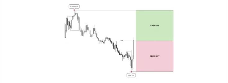
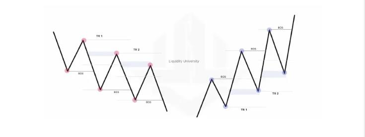
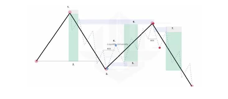
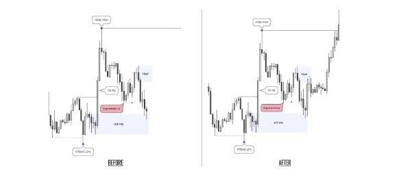
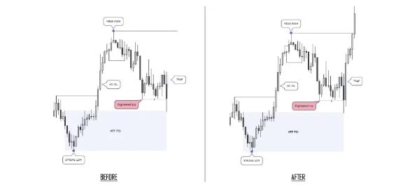
The Trading Ranges in a few words are your “area or range of work” in which we are going to focus our attention and define our POI in the best areas for shorts or longs (Premium & Discount) in order to enter a trade with the best positions. For example, the simplest explanation about a TR in a bullish structure is where a Strong Low begins and a Weak High ends, that is it.
It is the last valid bullish impulse that the price has made by breaking the last high. It is basically where you will measure with the Fibonacci to know which area the price is in.
Every time the price creates a new valid structural point, you must update your TR. This is probably going to be a bit confusing but believe me, once you understand Trading Ranges, you will start to have a very different view of the market.
And this at the beginning can be very repetitive, but it is for the sole purpose that you understand it well, because as we go more advanced there will be no need to highlight that it is a Strong Low & Weak High, a Break of Structure, etc. Afterwards, just by seeing certain lines on the chart you will already know what they mean and the purpose of each one, and everything will be much simpler and more intuitive.
Explanation:
Let’s break down this image:
A Pro Trend TR is the one that we will use to operate in favor of the trend.
For example: If we are in a Bearish trend and we are seeing the structure in 4h, our TR will be the tip of our Strong High and the end of the impulse, which is our Weak Low (the end of the TR). And then wait for a pullback into a POI in the Premium Zone.
NOTE: A TR is not defined until it is clear that the price has finished its momentum and started to pull back, since many times you will think that the TR is already defined, but if the market does not start its pullback, it can continue its current trend even more.
A Counter Trend TR is the one that we will use to operate against the trend of our main TR. It’s important that you understand this concept perfectly well since it is the one that will help us to be able to operate with the LTF BOS in the Strong Lows or Strong Highs and that will allow us to have those high-Risk Rewards.
The TR CT will be more noticeable on smaller TFs (LTF) than the TF of our main TR (HTF). This TR is going to help us a lot to be able to trade ONE PAIR ONLY and get the most out of each movement, be it Swing, Intraday, or Scalp.
Let’s break down the image below: Suppose that the price is in a bearish structure in 4h and you entered the sale at the first Strong High. Now, the price reaches the next Weak Low and you close partials because your Weak Low is your TP Swing.
After it touches your TP, the price breaks the Weak Low creating a new LL, and starts its pullback from 4h to the Discount Zone of your 4h TR. You can operate that pullback in a lower TF waiting for a Break of Structure in LTF like 15m, and once you have a Break of Structure in LTF, now you have a TR CT that will help you enter the Discount zone of your TR CT to operate a Counter-Trend intraday.
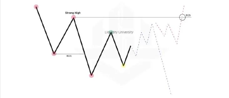
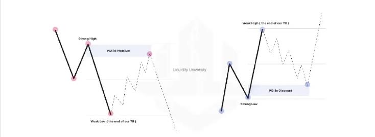
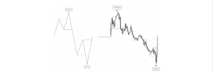
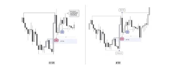
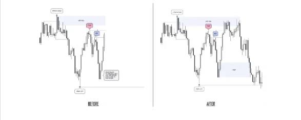
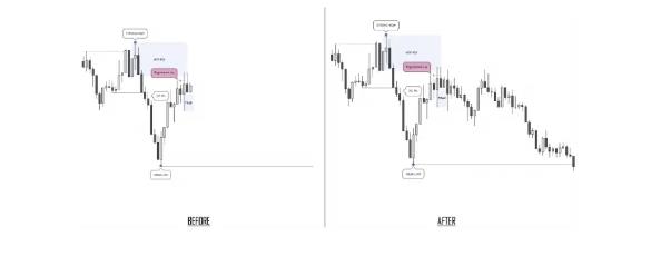
At the beginning of a Bearish Trading Range, we are going to see a Strong High. At the end of a Bearish Trading Range, we are going to see a Weak Low. That Weak Low formation is going to let us know that our Bearish Trading Range has been confirmed.
NOTE: A Strong High will always form a Weak Low.
Once an SH is formed, an opposite Break of Structure needs to happen ON THE SAME TIMEFRAME to confirm the trading range.
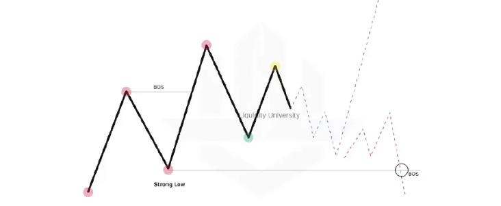
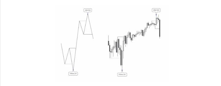
At the beginning of a Bullish Trading Range, we are going to see a Strong Low. At the end of a Bullish Trading Range, we are going to see a Weak High. That Weak High formation is going to let us know that our Bullish Trading Range has been confirmed.
NOTE: A Strong Low will always form a Weak High.
An opposite Break of Structure needs to happen ON THE SAME TIMEFRAME to confirm the trading range.
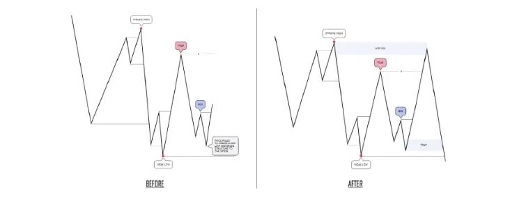
Now that you understand how to identify a Trading Range, it’s now time to learn what the common traps are INSIDE of the TR (your area of work). Having the ability to understand these traps and identify them will allow you to anticipate where the market is likely to draw to, and it will teach you how to approach certain situations. We recommend that you focus on the LOGIC of the TRAPS at the beginning and not try to copy and paste the variations on the charts. The variations that the price will make will depend on several factors such as the structure, the creation of liquidity, and Inducements.
NOTE: Without the proper understanding of Liquidity these TRAPS will be hard to understand. These TRAPS are an OBJECTIVE way of seeing Liquidity, SMT, and inducements. You can decide to see the market in the way shown in CREATION or in T1 and T2. Regardless of your opinion, our TR is the main framework that allows us to know where we are in the market, or as mentioned, the “Area of work”. This will take time to train yourself, so be patient with your process and practice.
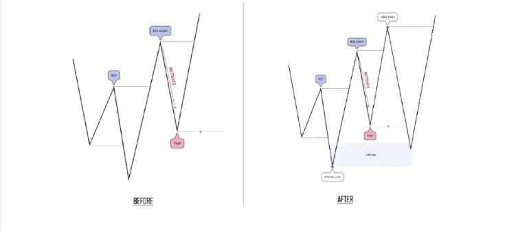
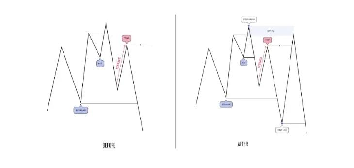
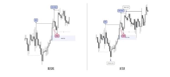
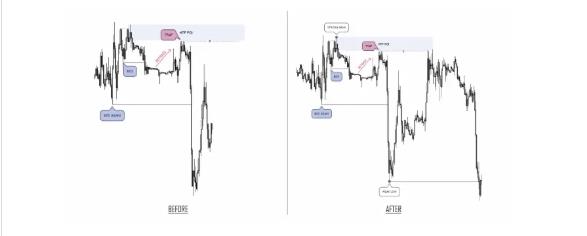
To identify Trap Type 1, you want to see a BOS, followed by a Retracement, and then a BOS once again. That Retracement leg is going to be the Trap. There are 2 variations of this, as the Trap can sometimes form before Price takes out the external and sometimes it will form after Price takes out external, but the same logic applies. Let’s take a look at a diagram to show how this looks and then explain why this is such a deadly trap. I will label the diagrams as Variation 1 & Variation 2 to differentiate the variations of this Trap.
Bullish Trap Type 1 (V1)
Bearish Trap Type 1 (V1)
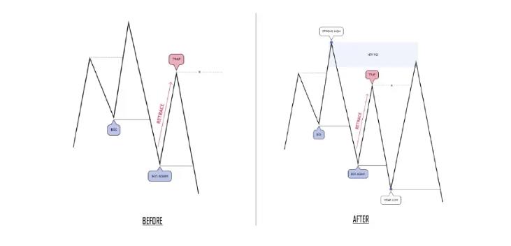
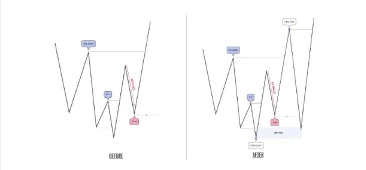
So, what makes this a trap? The reason why this is a Trap is because the large majority of traders are going to try and Buy/Sell from this Price Leg. So, there are stop losses, as well as protective Buy Stops/Sell Stops resting above/below. This is because they are trading based on Market Structure alone.
In a Bullish Scenario, they see a HH, HL and another HH, so they expect that recent HL to hold. In a Bearish Scenario, they see a LL, LH and another LL, so they expect that recent LH to hold. After it fails, their stop losses will be hit and Buy/Sell stops have been triggered and price will reverse again leaving them in loss.
On top of all of this havoc, they now believe that since that leg was broken, the market has changed trend. Now they will get stopped out once again since they have the wrong directional bias. As you can probably tell by now from this description, just how deadly this trap really is.
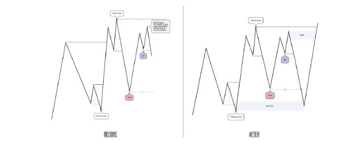
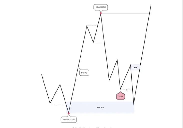
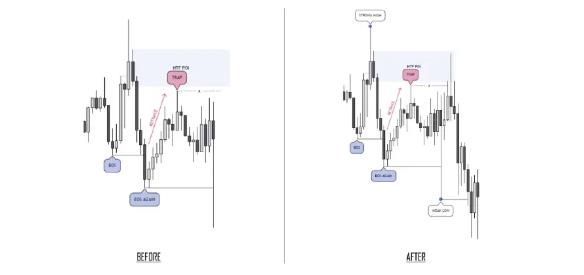
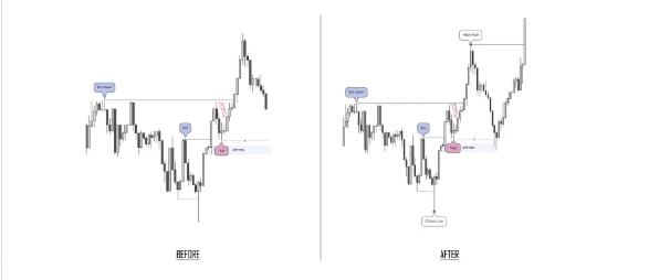
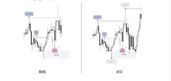
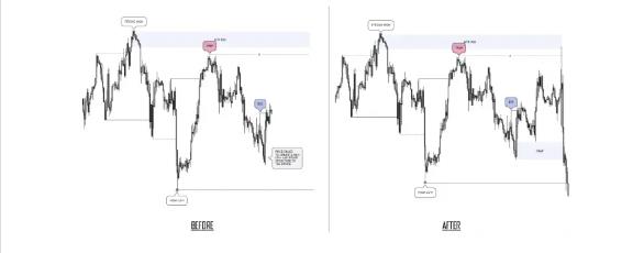
To identify Trap Type 2, we have to understand what is known as a “Failure Swing”. A Failure Swing is when Price fails to create a new Structure High or Low and then breaks structure in the opposite direction.
Nothing is 100% in the market, but this is the signal, and we can then anticipate that the market is forming a Failure Swing. This can happen whether there is Internal Range Liquidity in the Trading Range or not. We will call this Variation 1.
For Variation 2, this is most likely to occur when there isn’t any Internal Range Liquidity. The reason is that Price needs a reason to go somewhere, so if there is no liquidity, the market has to engineer it.
Understanding this will teach you how to approach a Trading Range when there isn’t any Internal Range Liquidity. This is still considered to be a Type 2 Trap since the market will create a series of failure swings before reaching an area of significance such as an HTF POI and finally reverse.
Bullish Trap Type 2 (V1)
Bearish Trap Type 2 (V1)
Bearish Trap Type 2 (V2)
So, what makes this a trap?
In Variation 1, there are Buy/Sell stop orders above/below the red annotated Trap. The market then triggers those pending orders and reverses, leaving those traders in loss.
Once that High/Low has been taken out, many traders will believe the trend is changing since Price created a new HH or new LL, when all it is, is a stop hunt. So, they will attempt to trade in the wrong direction and get stopped out.
For Variation 2, it’s pretty much the same as I explained earlier. Price will engineer liquidity and that liquidity will have Buy/Sell Stops resting above/below it; this is the area annotated in red. The market will then tap into that HTF POI and then reverse, leaving them in loss.
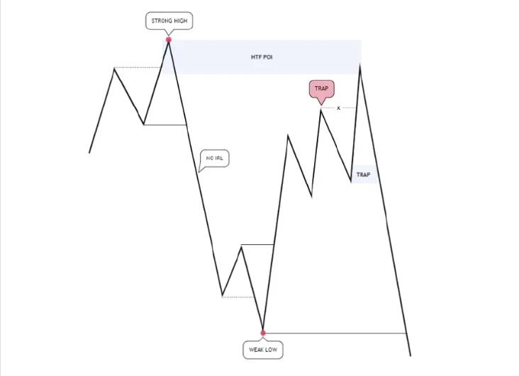
Those unaware of where Price is coming from will attempt to continue trading in the direction it has been creating the liquidity in, and it will take out those traders’ stop losses. So once again they take out both sides of the market before going in their intended direction.
Bullish Trap Type 1 (V1)
Bullish Trap Type 1 (V2)
Bullish Trap Type 1 (V2)
Bearish Trap Type 1 (V2)
Bearish Trap Type 2 (V1)
Bullish Trap Type 2 (V1)
Bearish Trap Type 2 (V1)
Bullish Trap Type 2 (V1)
Bearish Trap Type 2 (V2)
Bullish Trap Type 2 (V2)
In this lesson, we are going to cover the Point of Interest, or POI for short. A POI is a Price Level where we can expect the market to give a reaction from, an area where we can expect a setup to form and can also be where we can potentially execute a trade. The main issue people have with POIs is that there can be so many of them visible on the chart and the majority of people don’t know which POI to choose. That’s why we must have some rules behind the way we select them, to ensure we give ourselves the highest odds possible. Let’s go through some of those rules.
Rule 1: A High Probability POI must be selected from the Higher Timeframes. Depending on what TF you’re on, choose a POI in a higher TF.
Rule 2: A High Probability POI must have liquidity resting above it if you are looking to Buy, and below it if you are looking to Sell. This gives the market a REASON to tag into your POI, and it also gives the market a REASON to reverse from your POI.
Rule 3: A High Probability POI must be unmitigated.
Rule 4: A High Probability POI is the closest POI to the liquidity. In the topic of Liquidity, you can see how quickly they can cause those manipulations, so it’s most likely they will be very quick to reverse. So, if your POI is not the closest one, it’s likely you will miss the move.
This is one of the rules for valid POIs. IT MUST NOT HAVE BEEN MITIGATED FOR A POI TO BE VALID. The more times an OB is tested means that there are no more “SM” orders within that POI, and the more likely it is that it will be invalidated.
Sometimes the market will mitigate the base of your POI and then come back and mitigate 50% of the POI. That usually happens when you enter the opening of the POI and then you put Break Even and then the price returns to 50%, taking you out of the market in BE and then continuing where you had planned.
If you enter a trade and then the price takes you out on BE, you can enter again at 50%. But if the price gives you entry into the base of your POI and goes to where you had thought you should have already closed partials, and if the price returns to 50% of the POI, then there is very little chance that it will respect that POI again and the best thing is to forget that Set Up, since it does not make sense that the price mitigates your POI, goes to your TP, and then returns to 50% and returns to do the same.